
Two diagrams used in the analysis of groundwater are Durov Diagrams and Stiff Diagrams. These diagrams help scientists and researchers understand the composition of groundwater and its ion concentrations.
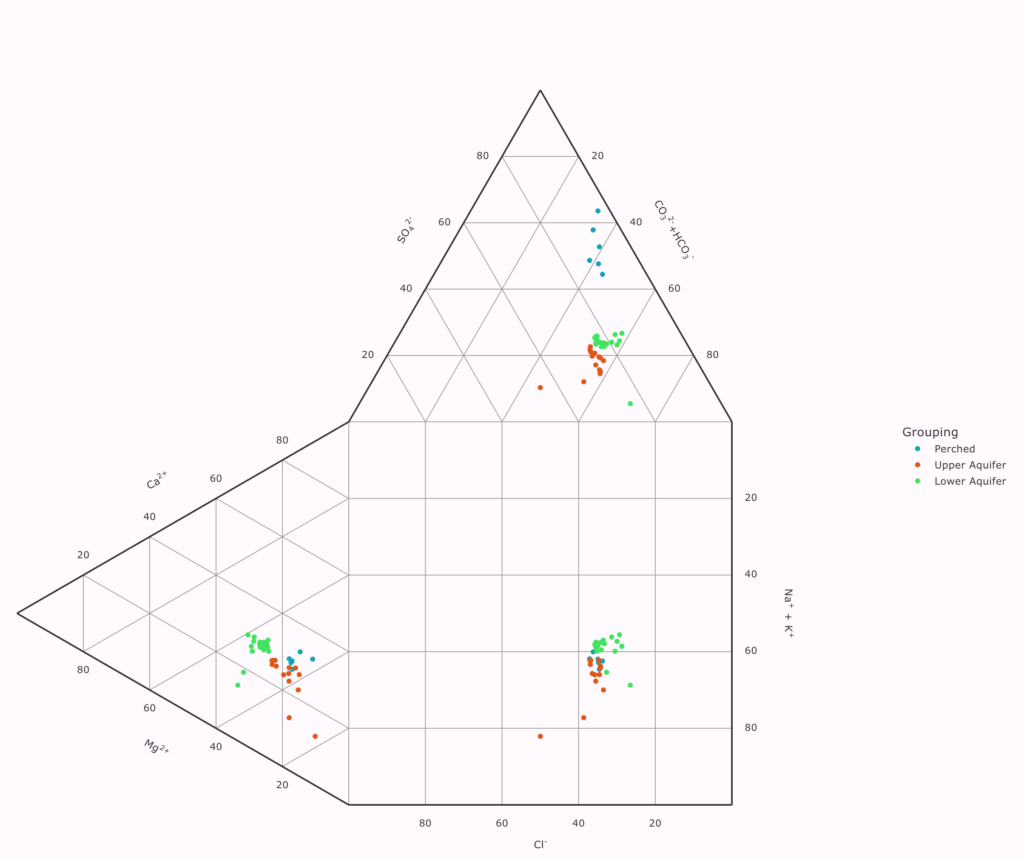
Let’s start with Durov Diagrams. Imagine you have a glass of water with different ions in it, like calcium, magnesium, and sodium. A Durov Diagram helps us see the proportions of these ions by plotting them on triangular panels. Cations, which are positive ions like calcium and magnesium, are plotted on one triangle, and anions, which are negative ions like chloride and sulfate, are plotted on another triangle. Combining these two triangles gives us a square grid at the bottom.
Now, we can place data points on these triangles based on the concentration of ions in the water sample. These data points show us what ions are present and in what amounts. We can even compare other important measurements like pH (how acidic or basic the water is) and total dissolved solids (TDS), which tell us how much stuff is dissolved in the water. This helps scientists understand the groundwater’s quality and its suitability for different uses.
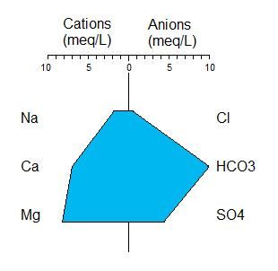
Moving on to Stiff Diagrams! Imagine you have a bunch of points that represent different ions in groundwater. Each point represents an ion like calcium, sodium, or chloride. Now, on the left side of the diagram, we plot the milli-equivalent concentrations of cations, which are positive ions. And on the right side, we plot the milli-equivalent concentrations of anions, which are negative ions.
As we connect these points, they form a shape, like connecting dots with lines. This shape helps us understand the overall composition of the groundwater. The size and shape of the polygon tell us about the concentrations and ratios of different ions in the water. If we know what these shapes mean, we can learn a lot about the quality and characteristics of the groundwater.
In a software program, we can create these Stiff Diagrams easily. We can even group ions together and control the order in which they’re shown on the diagram. And there’s something called a Stiff Map plot, where each water sample is placed on the diagram based on its X and Y coordinates. This helps us see patterns across different locations.
So, whether we’re using Durov Diagrams to compare ions or Stiff Diagrams to understand the composition of groundwater, these tools help scientists make sense of the hidden world beneath the surface. It’s like solving a puzzle that helps us better protect and manage our water resources.
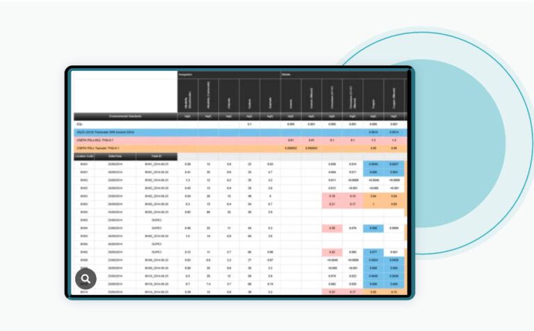
Free ESdat Geochemistry Software
ESdat Geochemistry Graphs provide a comprehensive solution for visualizing geochemical data in milliequivalents per litre. These diagrams encompass widely-used formats, including Piper, Schoeller, Durov, and more. For more information on ESdat Geochem visit
Related Articles to Stiff Diagrams
How to do Piper Diagrams in Chemistry Water Analysis
What are Schoeller diagrams in geo-chemistry
Exciting Software Update Unveiled for ESdat Users Worldwide, Elevating Data Management Experience


[…] Differences in Durov Diagrams and Stiff Diagrams […]